Wednesday, March 30, 2011

Artist Spotlight: Ansel Adams

P H O T O G R A P H Y
Ansel Adams


Ansel Adams is a inspiration to me in my black and white photography class. His use of tone amazingly brings out so much depth into his pictures. His most famous work was in the Yosemite valley, which eventually led to the founding and creation of the Yosemite National Park. 

Thursday, March 24, 2011

Film: American Visions, Age of Anxiety- Robert Hughes

I enjoyed the film a lot. I thought it had a fun way, an honest way of depicting each artist in its feature. My favorite part was when Jeff Koons was questioned about his work, and whether he sculpted or not. Overall, the film was informative, covered a lot of topics and artists and further expanded my experience into the world of art world. 

Featured Artists: 
James Turrell

Jeff Koons


Louise Bourgeoise 


Donald Judd

Richard Sierra


James Rosenquist


Just to name a few....

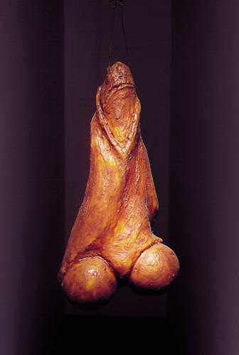
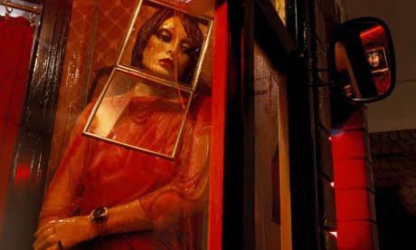
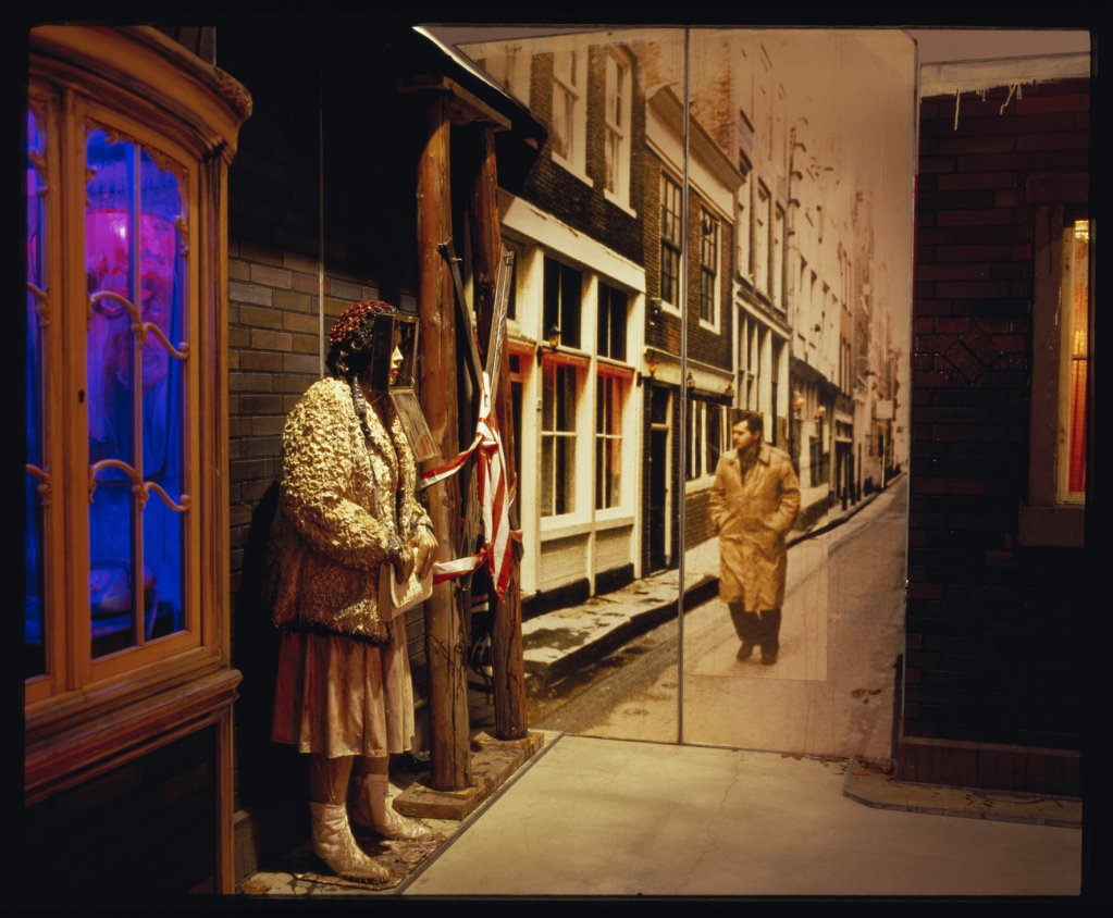
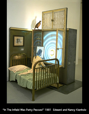
For the Assignment:  Ed and Nancy Keinholz


*Edward used found objects; materials he would find in a alley, a trashcan, or even a flea market. He used these materials to confront the viewers with questions of human existence, and inhumanity in the twentieth-century. By showing the inhumanity that has happened not only recently but in years past shows the historical context that's implied, while presenting it in a contemporary setting. 

*I think they show there meaning by how they're represented in the piece itself. For example, one of the pieces uses a bullet, which is housed in a cut-out of a cross. The meaning I interpreted was that there is inhumanity in everything. It's also ironic in a lot of ways, especially for this piece because many religions are opposed to violence, and murder. But from what I gather, the bullets meaning isn't a peaceful one, but rather an omen that even when we feel safe with what we believe, something can always happen because we, as a people, can be unpredictable.


Edwards pieces are usually viewed in galleries or museums. But they're not placed in a boring room, the piece takes up the space usually, and creates it's own room in which to present its context. They are almost like mini stage pieces, parts of something you would see in a play on stage. Sometimes the have molded people, furniture, just about everything. Whichever way it's set up, each piece is set up to describe and show it's purpose for being there. 


I think the site that the work is set up in really has no meaning until that meaning is created through the artwork itself. The context for which the piece was set up to show, gives it all the meaning it needs. Yet the meaning of the actual piece is always debatable, and subjective to each viewer who happens to pass by. I personally needed some more information in order to figure out what was actually being represented.


Artist Spotlight: Louise Bourgeois

 Louise Bourgeois

Louise has an interesting style that very unique to her as an artist. Her work is something one can pick out from a gallery just by a mere glance if you've heard of her before. French-born-American, she moved to America later on to pursue a career in her artwork. Most of her works are meant to be "uncomfortable" to look at, but that's the raw reality that she's presenting. It's emotional and forces the viewer to take a step back, and think about feeling in a piece that's merely representational. 

Arch of Hysteria
Her work includes both painting and sculpture, and she often uses organic materials such as wood, marble, and also steel, bronze and plastic.


Some of her best known works include “AraƱa” (1994), (spider), a work inspired in the maternal figure. She has various spiders all over the world, the original made in steel and marble, and nine more in bronze.


"Seven in bed", above, used fabric, wood, stainless steel and glass as it mediums. 

Janus Fleuri, Bronze
I really enjoy all of her works, the one above, like many of her other works makes me feel uneasy. I think that's mostly because I'm not really sure what I'm looking at, but contextually I understand it's possibilities. That's one of the main reasons I enjoy her works so much. 

Wednesday, March 23, 2011

Artist Spotlight: Kako Ueda


K a k o  U e d a

Kako Ueda is a talented artist in Japan. Ueda chose the versatile and fragile paper as its medium term due to its rich history in Japanese culture. Ueda used a meticulous process of cutting paper to create images and achieve an impressive result. His great thoroughness and attention to detail make each one of his pieces is a true work of art


"PJS (Portrait Series 1)"
Kako Ueda claims paper is a “two and a half” dimensional medium. Though it is flat, it brings a new perspective to drawings; and is something in itself, rather than simply a backdrop upon which some other medium can shine. Ueda favors color over the flat white of plain paper, and often dresses the cuts in watercolor or acrylic. 

"Reciprocal Pain"


On occasion, Ueda has put together entire cut paper installations that employ both flat cut paper compositions as well as three dimensional paper sculptures.


"Conversation"
With the amount of color, and precision involved in each piece, every piece is unique and beautiful. I think this artist's work represents the concept of line and form, and I've found these works to be very inspirational. 

Monday, March 21, 2011

Artist Spotlight: Janine Antoni

Janine Antoni

Saddle

Janine Antoni uses her own body in a lot of her works. For this piece (above) she used her own body as a mold, where she covers herself in raw, wet cow hide. Here, she is implying presence through absence. The presence is implied in the outline, but since the sculpture is actually hollow the female form we perceive is absent. 

Lick and Lather
Here, she uses a soap and chocolate for the media. She mold these heads, and then lathers and licks them to create this form. 

Moor
This piece is made out of materials that have a value of some sort, which are put together and made into a long rope. Each piece can be seen clearly, allowing the viewer to piece together their own stories from it

Loving Care
In the video we watched in class, Janine mentions how this piece has an ironic ring to it. How, we as humans drink the milk from cows, yet in this image, the cow appears to be nursing, or drinking from her

Artist Spotlight: Brian Dettmer

Brian Dettmer : b o o k  a r t


~*~*~*~


Brian Dettmer takes books, and transforms them into something unthinkable. He cuts, carves and sculpts these works of literature, but doesn't change their purpose. The book is still a book, its just being presented in  a non conventional format. 


His work involves both appropriation and alteration of media to transform and/or reveal or remove content from the original source. Each piece is unique, and very intricate as its transformed from a dusty book off the shelf, into a piece of fine art.


~*~*~*~


Dettmer uses all kinda of book in his creative process. He seals the books before he cuts into them, without and forethought as to what he will reveal. He never removes or inserts any content from the book, instead he lets the book transform itself while he works. He uses varnish to stabilize the remaining paper when he makes his cuts. Recently, he's been experimenting with the idea of bending, folding, rolling and stacking books to create different forms. Overall, his work is beautiful, and was a great inspiration for out book project in class. 

Friday, March 18, 2011

Artist Spotlight: Mel Robson

Mel Robson

I recently purchased a glass plate of Urban Outfitters the other day which reminds me a lot of this artwork. My plate, has an off center spiral that repeats the word, "Asshole". Mel Robson is a ceramic artist based in Brisbane, Australia who makes functional and non-functional objects out of porcelain.The ones below, feature a variety of designs, words and patterns. 


Ceramics is the media used, with various shapes and forms as well. I really love the colors and the designs chosen. It's not something one world expect on an everyday object like a bowl. The tick marks are especially fun (above). 


I love the bowl above. Robson has a series of bowls embellished with handwritten recipes from the women in her family. 


Wednesday, March 16, 2011

Art 108: Book Project

My BooK ArT

Project Transformation: Turn a book into a piece of art, or merely transform it's meaning into something else.


The cover of my book! I decided to transform a Alice in Wonderland book.


I had grown up with this story when I was younger. It was, and still is one of my favorite cartoons of all time. Recently, I learned a bit more about the author, Lewis Carroll. Which forever changed my view of the story itself. 


For the project, I decided to "remove" or hide Alice's identity in the story. Though it's still obvious who her character is, the real question is who she is as a person. 


Eventually, I arrive to my point in the book. Bringing to life the dark past of Lewis Carroll, and his inspiration for the story.

On the last page, is a picture of the real Alice. She was 11 years old. 

Art 109: Pen drawing

DrAwInG PrOjEcT

Objective: Draw a scene, minimum three objects, that represents the absence of a person. 


The chair 

The chair and the drawing

This drawing was done in blue pen. It was hard actually having to draw something without being able to erase it. But after this was done, drawing with pencil was much easier. It was well worth the lesson. :)

Saturday, March 12, 2011

Artist Spotlight: Xu Bing

Xu Bing


New English Calligraphy
These are some of the characters created my Xu for his, "Book from the Sky" exhibit. 

A Case Study of Transference

A lot of Xu's pieces have to do with writing and books. These pigs (above) have Chinese characters on them, and are standing on pages of books. However, the pigs can be considered a book. Which challenges the normal conventions of what a book actually is. Pushing the limits even further.

A book from the sky

A book from the sky is probably one my favorite works that I've found so far. Xu Bing created his own characters, which resemble Chinese characters for all of the writing, all of which have no real life meaning. The installation contains books, panels and scrolls. He used a traditional block printing method to create the work. It's first showcase was in 1988. 


The Chinese characters in this pieces seem to "float" or fly off the floor.